
Latest 7.6 update has some major changes in next parts:
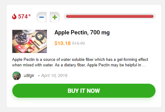
1. List layout was redesigned, now, it's more compact and has Hot counter. We also start to use new CSS Grid. This is new actual trend in design, because it allows to configure blocks between desktop and mobile version. For example, it's possible to have Button Block in top right block on desktop and Bottom full width block on mobiles. Previously it was possible only with absolute floating hack which is very buggy. Currently, our list looks awesome and very compact on mobiles which was not possible early
If you have any customization of file inc/parts/query_type1.php, you should change it according to new structure. You can also use old styles and names of classes, but you must add next css fallback code
/*Old News block*/
.news-community .rewise-box-price{font-size: 20px; line-height: 27px; }
.newscom_wrap_table{display: table;width: 100%;}
body .no_bordered_news .news-community{padding: 0; margin-bottom: 45px; border: none; background-color: transparent;box-shadow: none}
body .no_bordered_news .featured_image_left { width: 32%;}
body .no_bordered_news .news-community:hover{ border: none;box-shadow: none}
.featured_newscom_left{width: 170px;  margin: 0 20px 20px 0; padding-right: 20px }
.featured_newscom_left figure{width: 150px; max-width: 150px; height: 150px;border: 1px solid #eee;  padding: 5px; vertical-align: middle; text-align: center; position: relative;display: table-cell; margin-bottom:5px; }
.featured_newscom_left figure img{width: auto; max-height: 138px}
.newscom_detail, .featured_newscom_left, .newscom_btn_block{ display: table-cell;vertical-align: top; }
.news-community .not_masked_coupon{margin: 8px 0 0 0}
.newscom_detail h2{font-size: 20px; line-height: 22px; margin: 0 0 10px 0}
.newscom_detail h2 a{color: #111 !important}
.newscom_detail p{margin-bottom: 15px; line-height: 20px; font-size: 14px }
.newscom_detail .star-small{margin-bottom: 0}
.newscom_btn_block{margin: 10px 0 0 0; width: 180px; padding: 0 0 0 20px; vertical-align: middle; text-align: center;}
.news-community .post-meta span{margin: 0 5px 0 0}
.newscom_detail h3{font-size: 20px; line-height: 24px; margin: 0 0 15px 0}
.newscom_detail h3 a{color: #111 !important}
.newscom_detail .hotmeter_wrap, .newscom_detail .star-small{margin-bottom: 15px}
.no_bg_wrap .news-community, .no_bg_wrap .offer_grid.offer_grid_com{ box-shadow: 0 1px 3px rgba(0,0,0,.16); border: none;}
.news-community .temperatur{font-size: 18px}
.newscom_btn_block a.read_full_profile{margin-right: auto}
.grid_woo .button_action{position: absolute; top: 8px; left: 8px; z-index: 2}
.news-no-columns .featured_image_left { width: 220px; padding-right: 20px; margin: 0 0 20px 0; display: table-cell; }
@media screen and (max-width: 768px){
.mobile_compact_list{padding: 14px}
.mobile_compact_list .featured_newscom_left{float: left; margin: 0 20px 8px 0}
.mobile_compact_list .featured_newscom_left, .mobile_compact_list .featured_newscom_left > div{width: 120px}
.mobile_compact_list .featured_newscom_left figure{width: 120px; height: 120px; }
.mobile_compact_list .newscom_detail{width: calc(100% - 140px); float: left;}
.mobile_compact_list .info_in_dealgrid{overflow: hidden;}
.news-no-columns .featured_image_left { margin: 0 auto 5px auto; padding: 20px; display: block; }
}

@media screen and (max-width: 500px){
.mobile_compact_list .rh-expired-notice{display: block;float: none; margin-bottom: 5px}
.mobile_compact_list .newscom_detail h3{font-size: 18px; line-height: 20px; word-wrap: break-word}
.mobile_compact_list .wpsm_update, .mobile_compact_list .newscom_detail p{display: none;}
.mobile_compact_list .post-meta span{margin-bottom: 8px}
}
Place this code inside Theme option - General - Custom css2. There are small changes also in inc/parts/column_grid.php Now, this block has full width images in container and box shadows
3. We updated our shortcodes for membership sites. Check if you use them. Here new updated docs
There are many other fixes and improvements, you can read about them in chagelog